A full-page redesign of a local shelter's web presence — making the adoption journey clear, welcoming, and easy to begin for people who've never adopted before.
Project typeConcept / Redesign
My roleUX Research, UI Design
ToolsFigma, Adobe Illustrator
Duration3 weeks
Final high-fidelity design — Fur Paw's Home homepage
The problem
I was inspired by a real local animal shelter whose website made the adoption process feel confusing and intimidating. The site was outdated, offered no clear starting point, and buried its adoption form under multiple pages of navigation. First-time adopters — who make up the majority of enquiries — were dropping off before ever reaching out.
Core problem statement
First-time adopters don't know how to start the adoption process, leading to drop-off and missed connections between pets and loving homes.
My goal was to redesign the homepage so that someone with zero adoption experience could land on the site, understand what to do, feel emotionally connected to the animals, and take a confident first step — all within a single scroll.
Research & discovery
To ground the design in real behaviour, I conducted a competitor analysis of three pet adoption platforms and mapped the common friction points first-time visitors encounter.
Competitor analysis findings
I reviewed the RSPCA, PetRescue, and a local Brisbane shelter site. The pattern was consistent: adoption processes hidden behind institutional language, search tools too complex, and emotional connection sacrificed for information density.
Key insight
Every competitor treated the homepage as a directory. None treated it as a welcome experience for someone who had never adopted before. Emotional reassurance was missing entirely.
User personas
Based on my research, I defined two primary user types representing the majority of adoption site visitors:
🐾
Sarah, 28
First-time adopter · Young professional
Wants to adopt her first cat but feels nervous. Unsure if her apartment lifestyle is "good enough" for a pet.
Looking for a family-friendly dog. Has adopted before but is unfamiliar with this shelter's process and timeline.
Pain point: Can't filter by temperament or suitability for children.
User journey mapping
I mapped Sarah's journey from first hearing about the shelter to submitting an adoption enquiry. This revealed three critical drop-off points:
1
Arrives on homepage
Motivated but uncertain. Needs immediate emotional reassurance this is a safe, welcoming place.
2
Browses available pets
Drop-off #1. No filtering by age, type or lifestyle. Users feel overwhelmed and can't find relevant matches.
3
Tries to understand the process
Drop-off #2. Adoption steps buried in PDFs or separate pages. Users don't know what to expect.
4
Looks for social proof
Needs reassurance from others who've been through it. No testimonials on competitor sites.
5
Attempts to contact / apply
Drop-off #3. Generic forms that don't confirm next steps. Users abandon without completing.
Key design decisions
Every major design choice was driven by a specific user need identified in the research phase:
Decision
Rationale
Type
Warm amber/orange palette
Signals warmth and approachability. Avoids clinical blues common on shelter sites that feel institutional.
UX / Emotion
Filter bar above the pet grid
Addresses drop-off #1 — users can narrow by type, age and location without navigating away.
UX / Usability
4-step adoption stepper
Addresses drop-off #2 — making the process visible reduces anxiety for first-timers who fear the unknown.
UX / Trust
"Happy Tails" testimonials
Social proof directly addresses the fear of "am I doing this right?" that first-timers experience.
Conversion
Volunteer / Donate split CTAs
Recognises that not every visitor wants to adopt — gives supporters a clear path without cluttering the adoption journey.
Info Architecture
Real pet photos with name, age, breed
Humanises each animal with identity. A name creates emotional connection; breed + age sets expectations before clicking.
UX / Emotion
Visual design
With UX decisions mapped, I moved from wireframes directly to high-fidelity design in Figma. The visual direction was intentionally warm, playful but credible — reflecting the personality of a shelter that cares deeply about its animals and community.
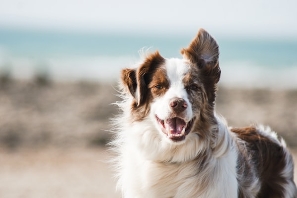
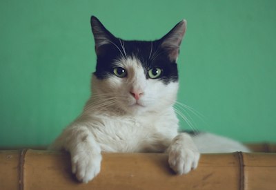
The grid mosaic of pet icons and real photos in the hero section was designed to immediately communicate variety and life — signalling "there's a pet here for you" before the user reads a word. The adoption process stepper was kept icon-driven and visual to reduce the perceived complexity of the four steps.
Reflection
This project taught me that the biggest UX problems in mission-driven organisations aren't technical — they're emotional. The barrier to adoption wasn't a broken form or a slow page. It was anxiety. Every design decision was ultimately about removing that anxiety, one scroll at a time.
✓ What worked well
Adoption stepper successfully surfaces the hidden process
Filter bar placement reduces friction at the main drop-off point
→ What I'd do next
Conduct usability testing with 5 first-time adopters
Build real search/filter functionality in code
Add individual pet profile pages with adoption forms
Design a mobile-first version — most browsing happens on phone
What this project demonstrates
The ability to translate emotional user needs into clear structural decisions — connecting UX research, information architecture, and visual design into a coherent experience, not just a pretty screen.
See it live
Explore the real interactions, filter functionality, and pet profiles.

 Dog
Dog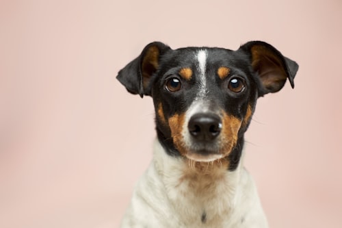 Dog
Dog Cat
Cat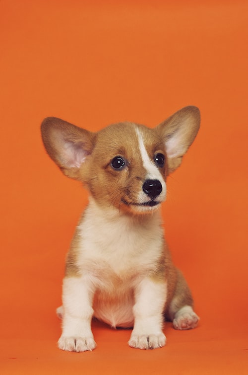 Dog
Dog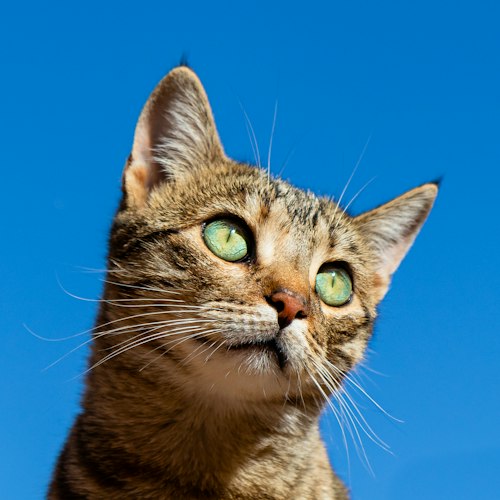 Cat
Cat Dog
Dog